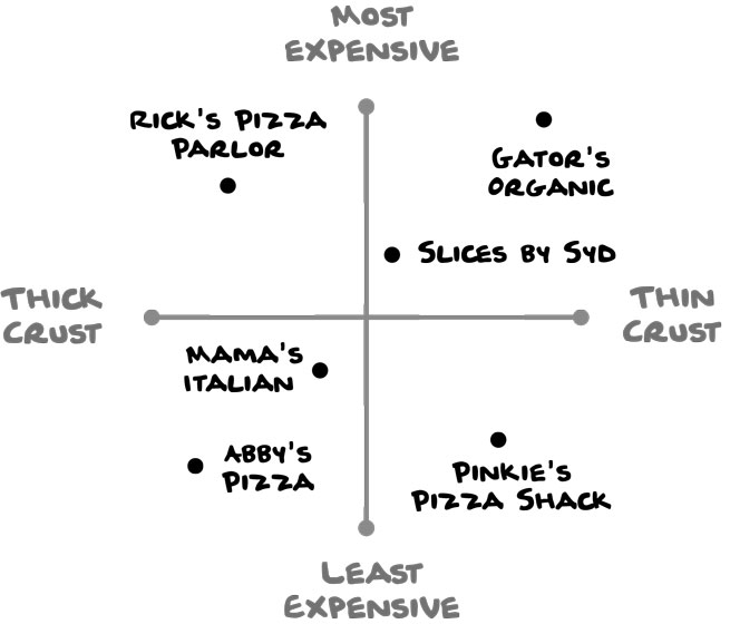
4. Quadrant Diagram
A quadrant diagram illustrates how things compare to one another. You can create one based on exact data (e.g., price of a slice, thickness of pizza-crust) or ambiguous data (e.g., fancy or casual, quality of service, or tastiness).
This diagram would be more exact with prices and crust measurements. (But how do you properly measure the thickness of pizza crust anyways?)